FIGIF

Year
'22
Client
FIGIF Vegan Cosmetic
Service
Branding
FIGIF’s typography reflects its core values—natural beauty, elegance, and authenticity. With organic serif forms, it creates a timeless and intentional visual identity rooted in nature.
© FIGIF
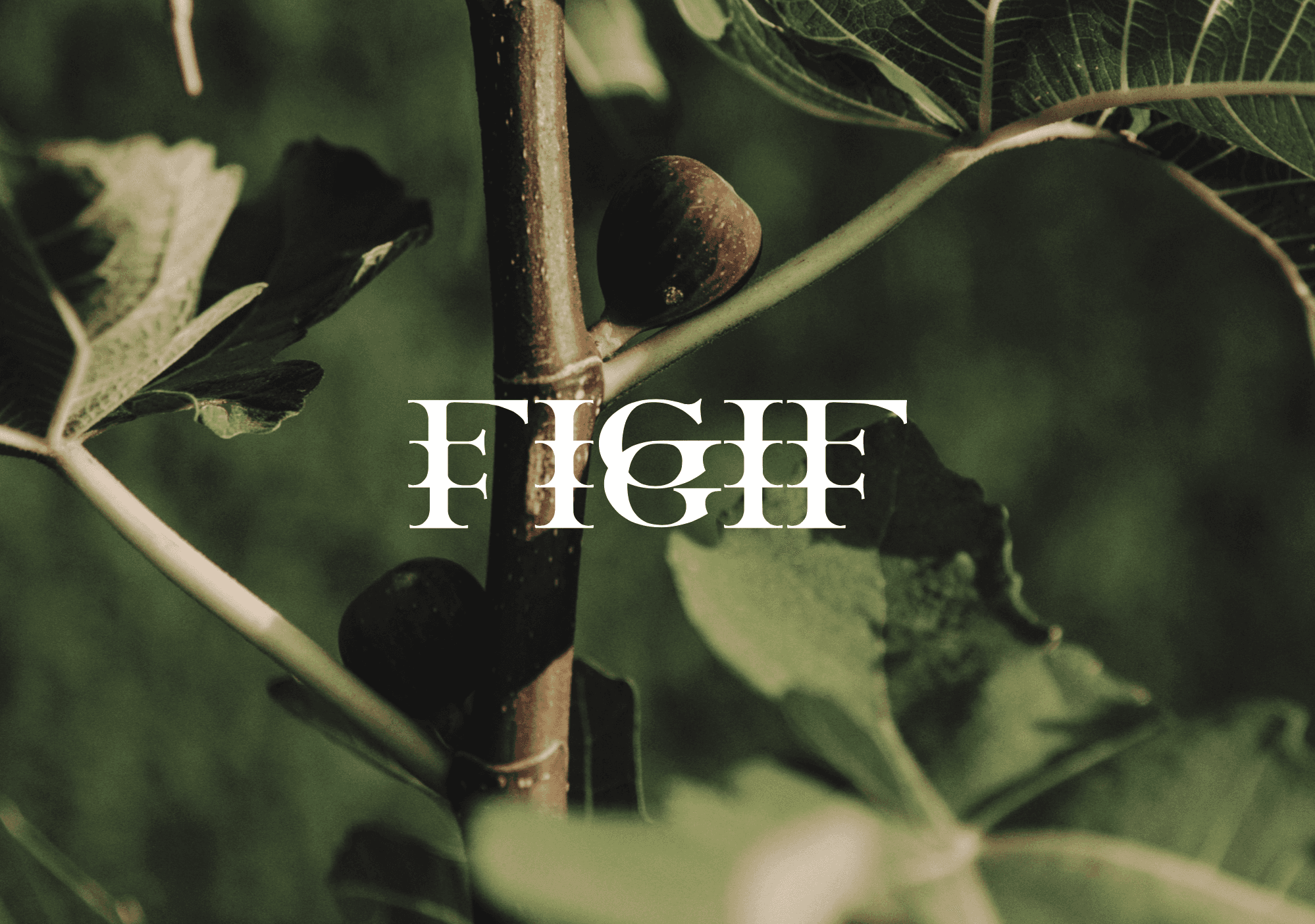


FIGIF — Typographic Visual Identity
The project aimed to create a typographic visual identity for FIGIF that communicates natural beauty, elegance, and a genuine connection to nature—while avoiding fleeting design trends or overly polished aesthetics. The goal was to achieve a sense of authenticity and timelessness through typography, ensuring the brand feels organic, balanced, and enduring rather than artificial or trend-driven.
To achieve this, the design focuses on serif typography with soft, organic curves that reflect natural forms and evoke a feeling of craftsmanship and intentional design. This typographic approach balances refinement with warmth, embodying FIGIF’s values of natural beauty and elegance. The result is a visual identity that feels sophisticated yet grounded—timeless in its expression and deeply connected to the essence of nature.
THE GARDEN
KOI