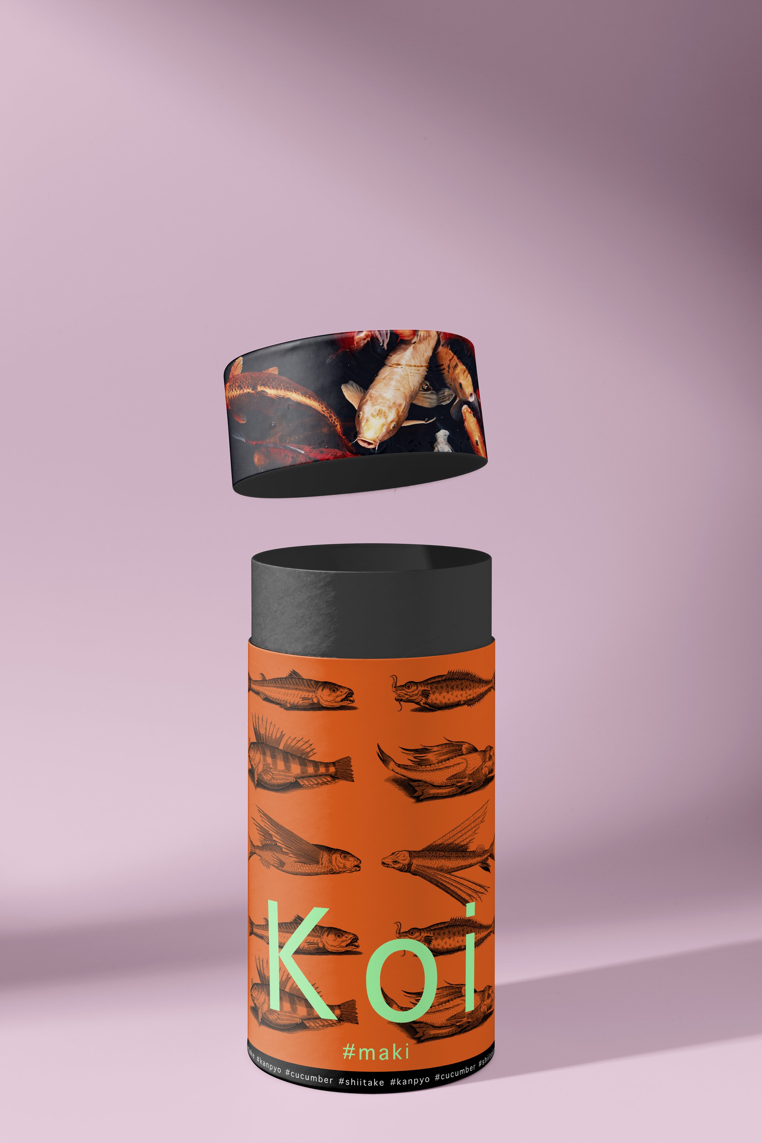
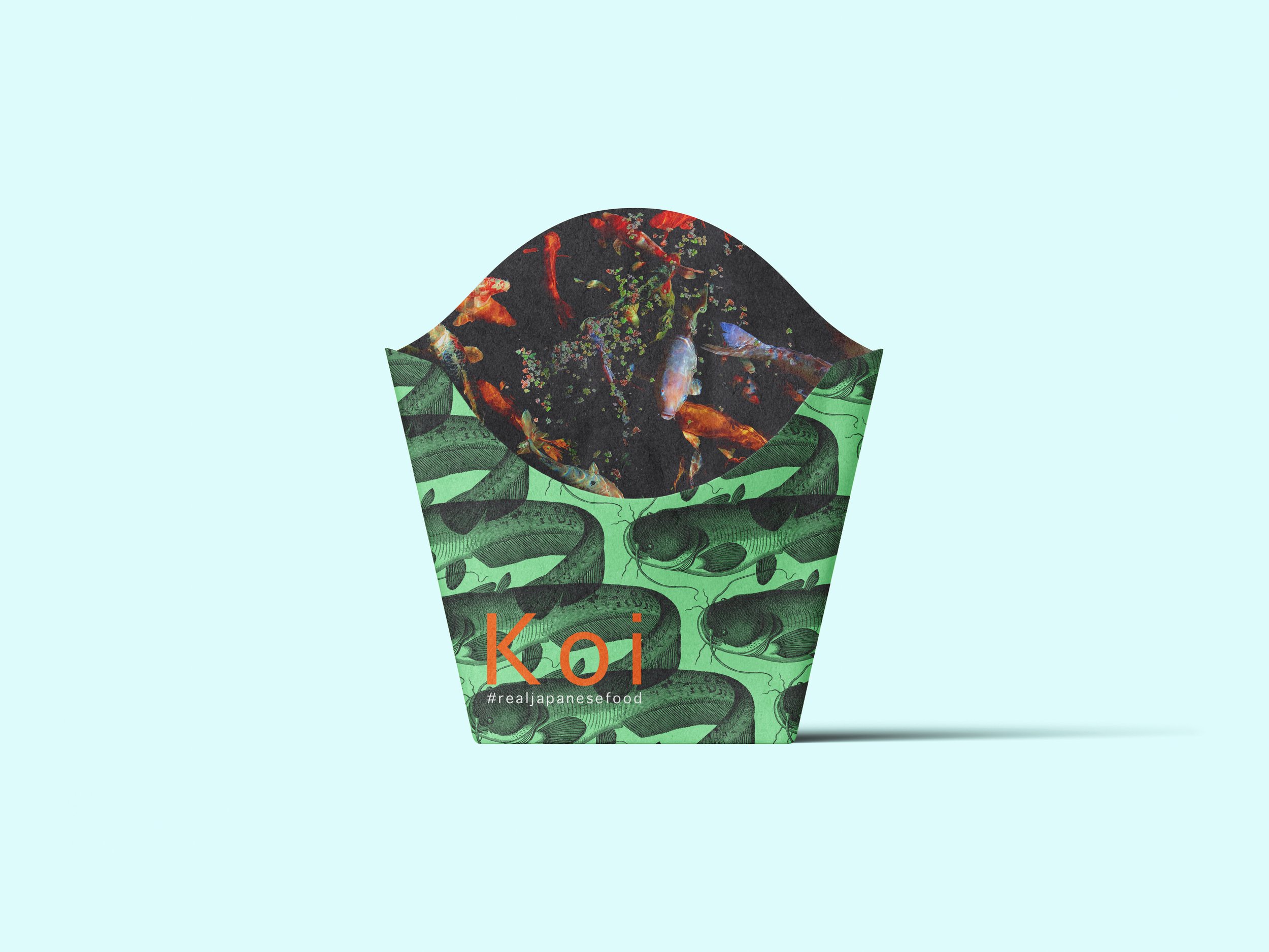
KOI – Colour as a Bridge Between Tradition and Modernity
In the redesign of KOI, colour plays a key role in telling the story of its evolution—from a traditional Japanese restaurant to a modern, health-focused fast-food chain with an urban vision. The chosen palette not only pays tribute to Japanese visual heritage—drawing from nature, bamboo, ceramics, and ukiyo-e landscapes—but also introduces vibrant, contemporary accents that align with today’s social media aesthetics.
Colour serves as a visual thread connecting the past with the present: neutral and warm tones evoke calm, cleanliness, and authenticity, while contrasting highlights add freshness, energy, and memorability. This carefully curated combination reinforces KOI’s identity as a brand rooted in cultural respect, yet ready to engage with new generations.