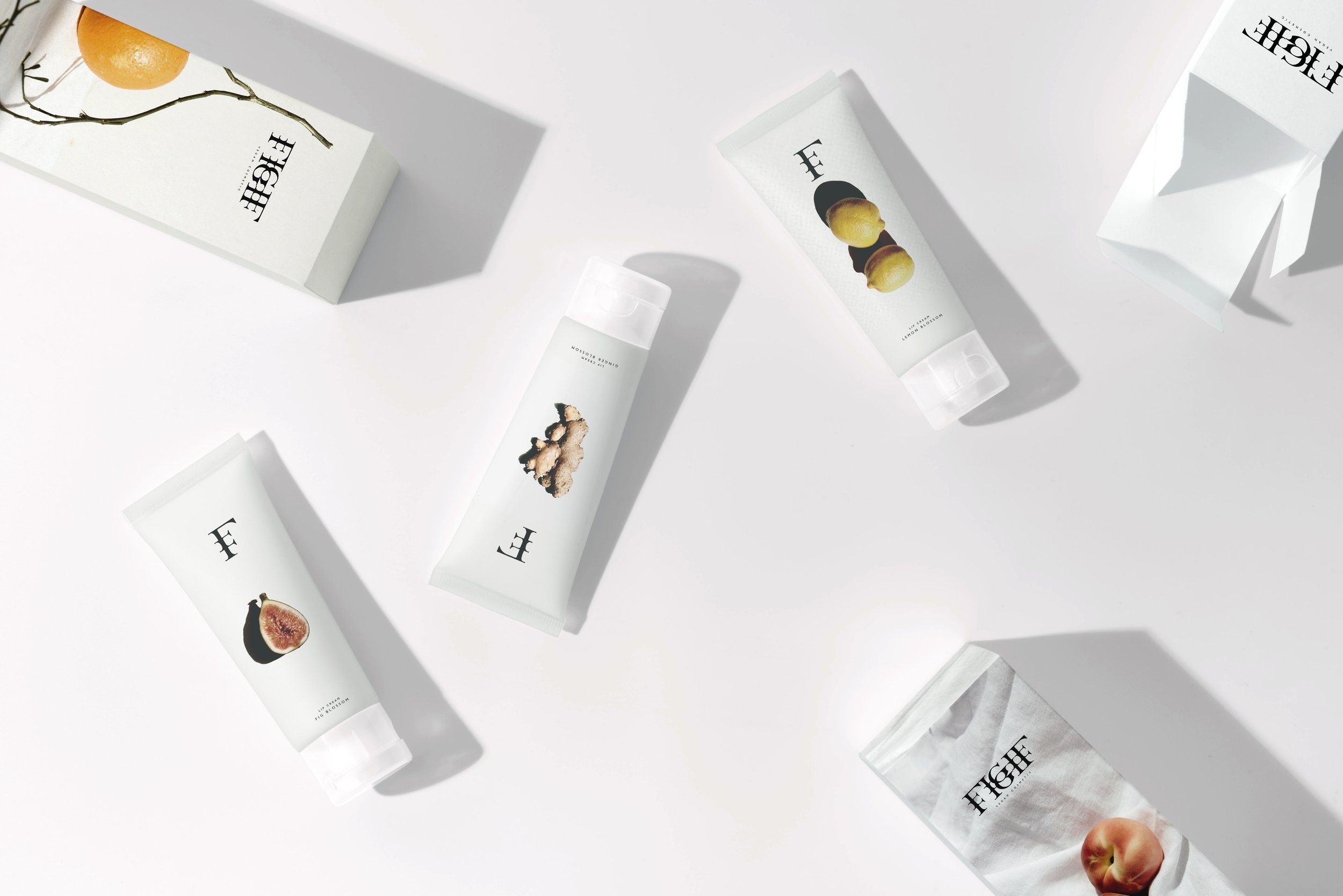
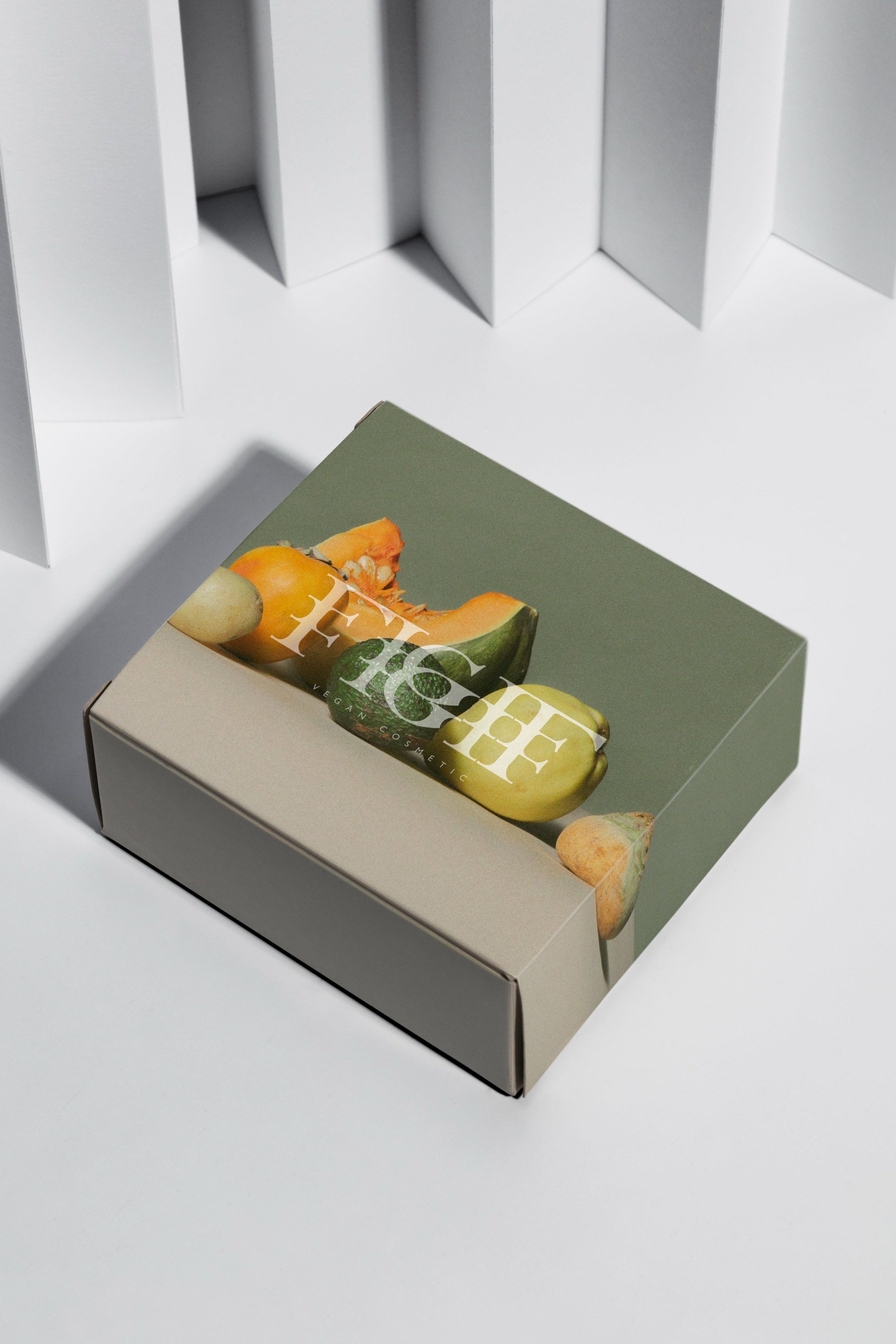
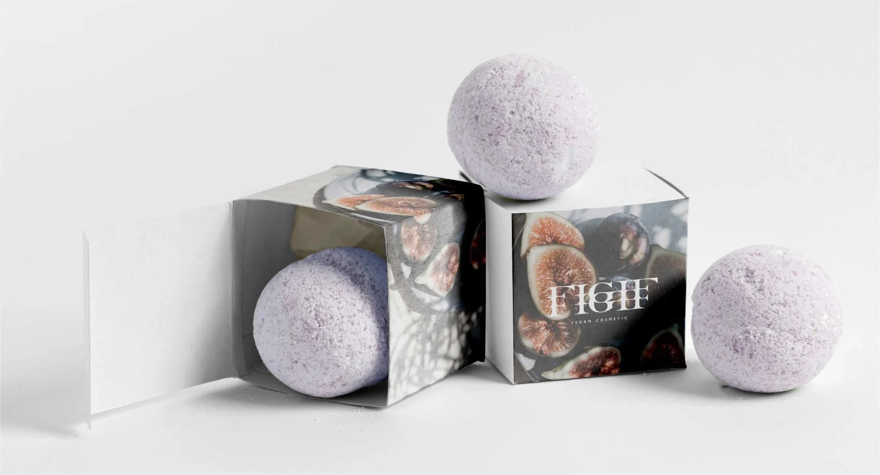
FIGIF - Typography as a Reflection of Natural Beauty
In the visual identity of FIGIF, typography is more than a design element—it is a silent storyteller. The use of serif letterforms with soft, organic curves draws a subtle parallel between the rhythm of language and the shapes found in nature. Each terminal, each stroke, echoes the gentle flow of leaves, branches, and natural movement, reinforcing the brand’s commitment to harmony between humanity and the environment.
The choice of type not only conveys timelessness and elegance, but also grounds the brand in a tactile, almost handmade sensibility. It avoids fleeting trends in favour of a form that feels lived-in—refined yet imperfect, much like the natural extracts at the heart of FIGIF’s products. The typography works in tandem with imagery and materials to express a visual language that is both conscious and premium, organic yet designed with intention.